


1
2
3
4
5
6
7
8
Collaborative Ideation
We collected all of our ideas through several sessions with our stakeholders.
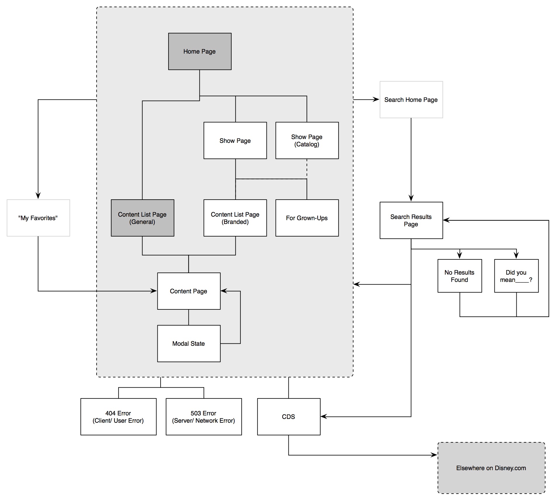
Information Architecture
Keeping the structure simple felt important for our young audience.
This early user flow map emphasizes the content experience for kids (shown within the gray box). Illustrating this kept us focused on nailing the core experience first. It also encouraged us to remove layers and find even simpler navigation methods.
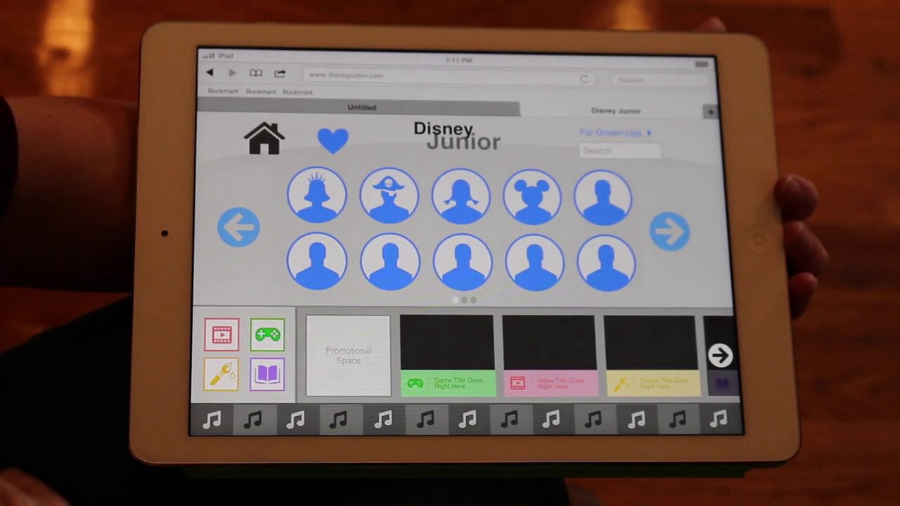
Paper Prototyping
To begin the design process, my UX team channeled our inner kids. Armed with post-its and markers, we created the entire app and invited our colleagues to quickly test it.
This approach made it easier to dismiss ideas that weren't working and efficiently iterate on ideas that did.
User Testing
Testing with our core demographic—kids aged 3 to 6—was crucial to our design process. We relied on user testing sessions to determine which aspects of our design succeeded and failed in resonating with our Guests.
These sessions were exceptionally helpful in showcasing user behavior to our product stakeholders. Viewing and discussing these sessions together motivated us all to find an effective balance between the needs of the business and those of our Guests.
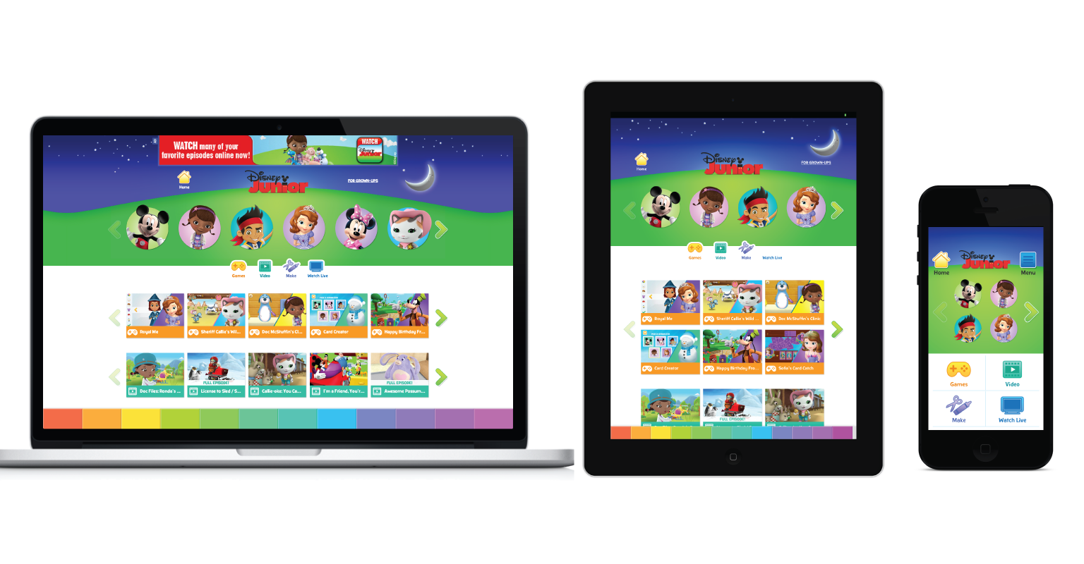
Responsive Wireframing
Designing a consistent experience for all devices was one of our key product priorities.
A "mobile-first" design approach allowed me to determine which elements were the most important to our young Guests and display them first.
The team viewed larger displays as a playground, where we could infuse additional elements that brought play and magic to the experience.
Dynamic Wireframing
To validate our responsive layouts, my UX team coded our approved wireframes.
Working with the front-end technology helped us empathize with our developers and resolve any friction our design may cause them.
Launch Day 2013
The new, responsive DisneyJunior.com when it launched in August 2013.