
UX Suggestions for Tinybop Parent Dashboard
1. Identify and utilize layout templates throughout the user flow.
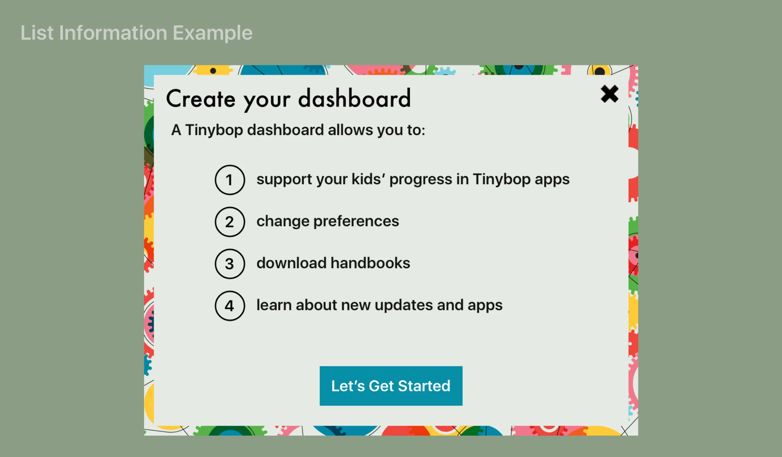
2. Visually break out lists. Effectively showcase the multi-dimensionality of the dashboard and its features.
3. Allow the user to choose a primary or default preference when many options are available. Share this information throughout the app.
To validate these suggestions, I'd recruit the help of my fellow colleagues and ask the following questions:
For Product:
- How did the requirement for a Parent Dashboard originate?
- How much time and effort will be allocated to redesigning the Dashboard vs building a new app?
- From a business perspective, what are the most important features of the Parent Dashboard? Is there an important feature that parents are not utilizing?
For Research:
- From usage data, how many parents create a Dashboard successfully? How many begin and then abandon the process? Where is the process abandoned most?
- From user interviews and usage insights, what are the most compelling features of the Parent Dashboard? Which are most used?
- How many languages does a parent normally choose via his or her Dashboard? How many of those languages are utilized (i.e. used during gameplay, viewed via the Handbook)?
For Engineers:
- Is it possible to share data (in this case a preferred language choice) across the app? Are there any security concerns with doing so?